Movo
Move more
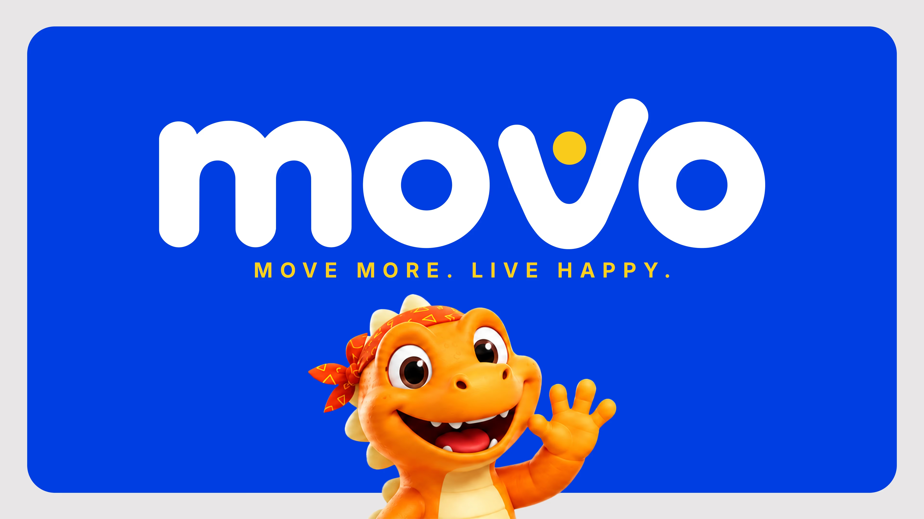
A fitness lifestyle brand identity built around energy, play, and habit. From the rounded wordmark and blue–orange–yellow system to a character-led mascot and app UI direction, every touchpoint says one thing: move more, live happy.


Brand idea
A movement app brand has to motivate without feeling generic.
For Movo, we built a high-energy system that works on a home screen, in campaigns, and on stickers people actually want — personality first, still product-ready.


Product & character
Logo, colour, and mascot only matter when they land in the product experience.
We extended the identity into app UI direction, campaign frames, and mascot moments so run, cycle, and walk feel like the same playful brand every time.


Start your project
Ready to build a brand that performs and has personality?
We design complete brand identity systems — from logo and character through to colour, product UI, and campaign-ready applications.