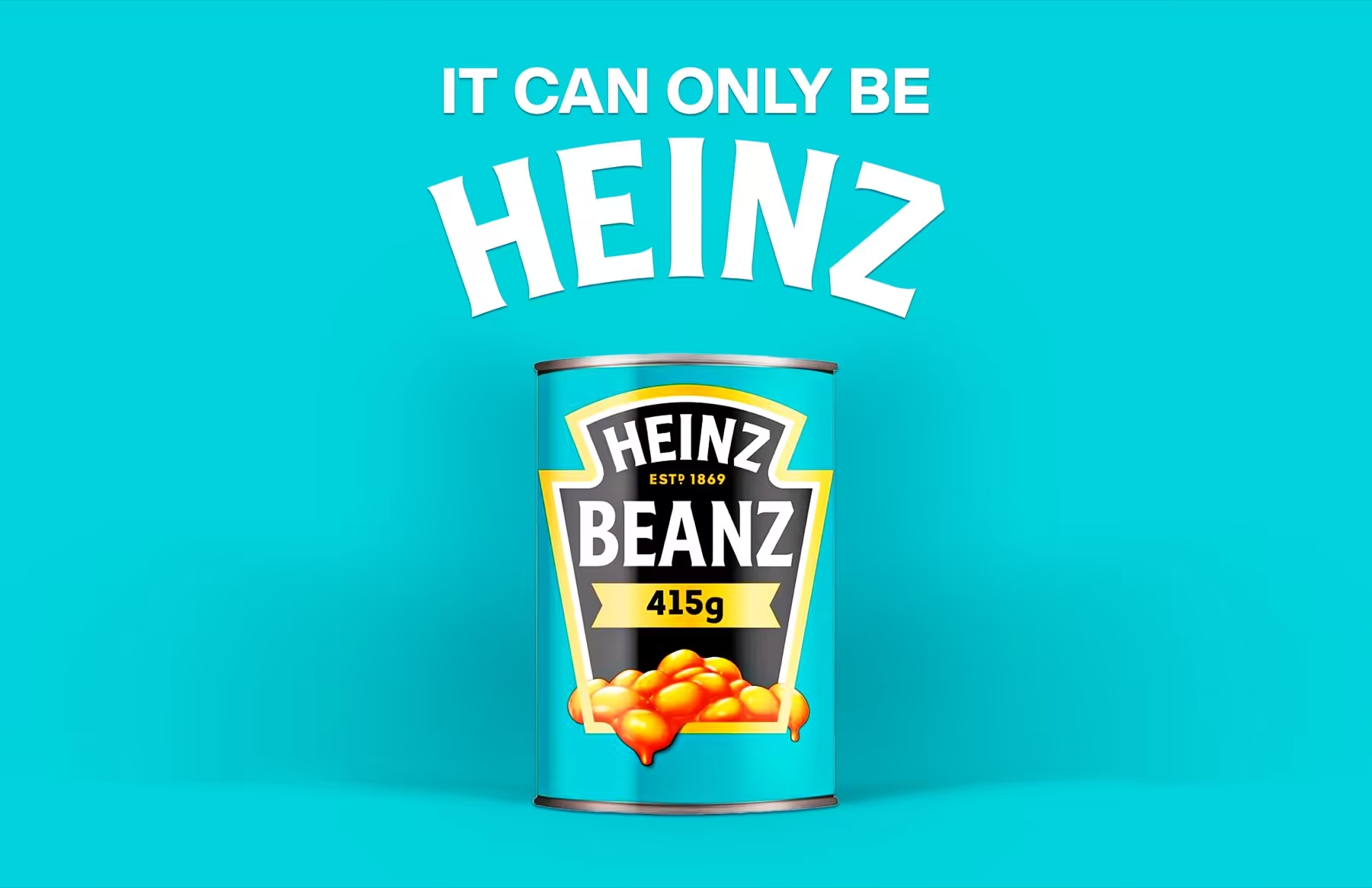
01 / Front Face Impact
The can needs a hero side that sells the idea fast.
We focus on the primary panel first so the product feels chosen before someone reads the details.
Primary panel / hero typography / visual anchor
This route focuses on can packaging where the hero face and surrounding panel information work together seamlessly — giving your product shelf-ready impact and dieline discipline.
What this route solves
The shape leaves little room for confusion. The front face should attract attention, but the surrounding structure needs to feel organized and production-ready.
We focus on the primary panel first so the product feels chosen before someone reads the details.
Primary panel / hero typography / visual anchor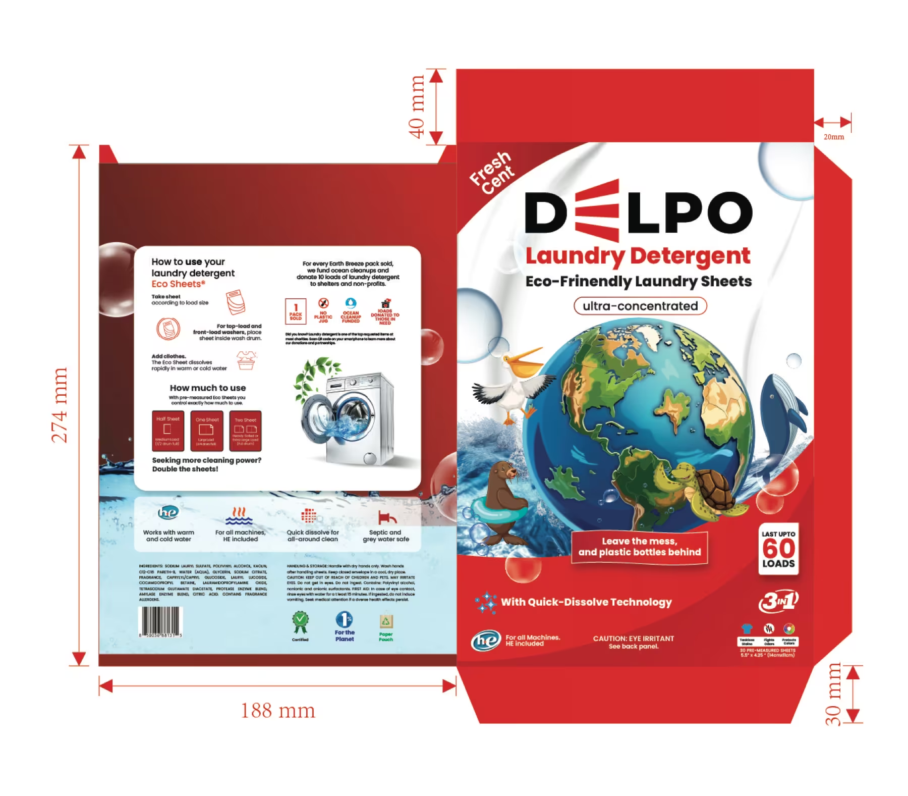
Dieline structure and information flow matter because cans are viewed from multiple angles on shelf.
360-degree flow / dieline specs / side panel structure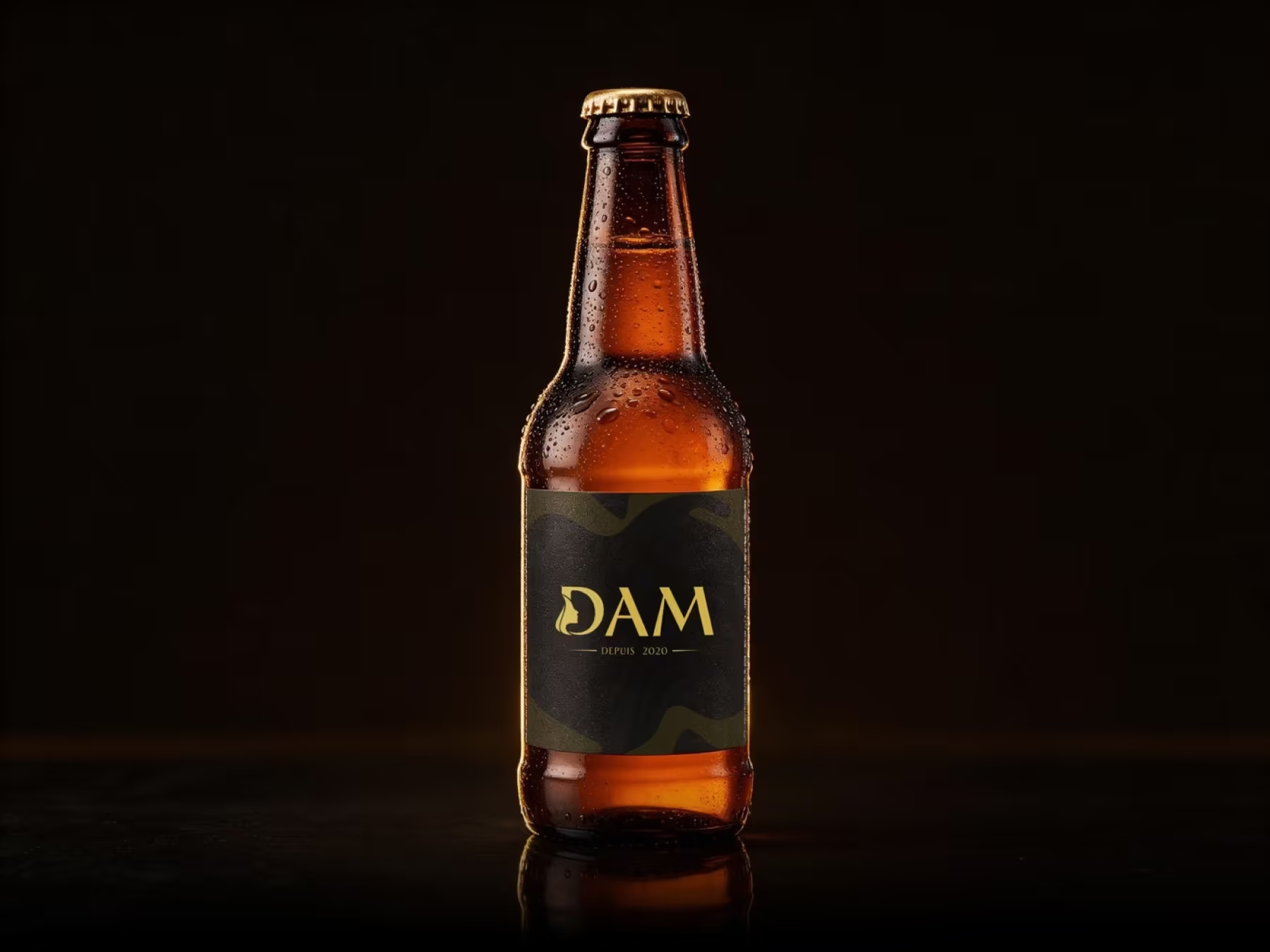
The surrounding hierarchy helps the packaging feel complete rather than decorative, ensuring visual balance from every angle.
Unified hierarchy / complete range / variant coding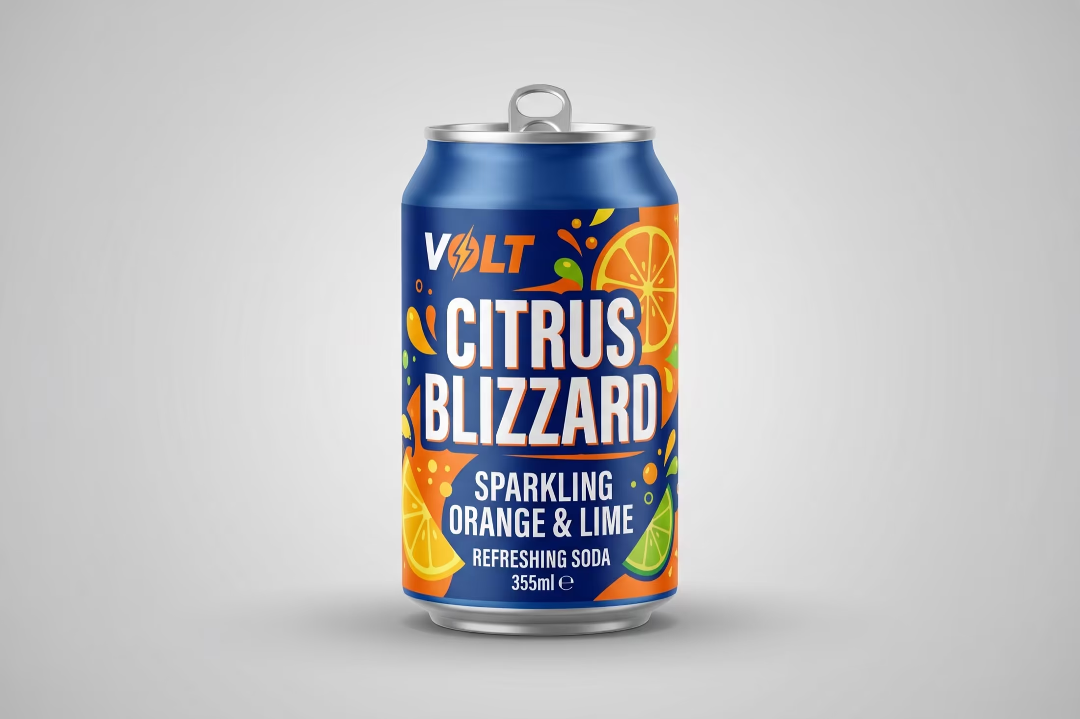
Mockups allow you to evaluate the can as an object in hand rather than judging a flat file, streamlining internal approvals.
3D render mockups / realistic lighting / vendor readyThe ideahits approach
If the immediate need is the can itself, this route keeps the work concentrated there — creating a stronger pack concept without losing practical production thinking.
This turns your packaging from a flat design idea into a believable, shelf-ready product object.
Why it helps
Focusing on structural discipline and visual balance at every angle.
Primary face designed to capture attention and communicate core value before anyone reads the fine print.
Dieline-aware layouts that keep ingredients, claims, and regulatory details clean and readable.
Photorealistic object mockups that build stakeholder and buyer confidence before print runs.
Files prepped to exact printer dielines so vendor handoffs happen seamlessly.
Transparent format scope
Fixed studio pricing with dieline setup and revisions included.
Focused front-panel concept direction to establish the primary visual anchor and messaging hierarchy.
Complete 360-degree can packaging including front face, supporting panels, and dieline layout.
Everything required to go directly into factory printing and production handoffs.
Multi-SKU beverage or food can range extension across multiple flavors, sizes, and variants.
Selected work
Front Panel Typography & Primary Visual Anchor
360-Degree Panel Flow & Regulatory Placement
Color-Coded Variants & Scalable Can Family
High-Contrast Surface Finish & Emboss Spec
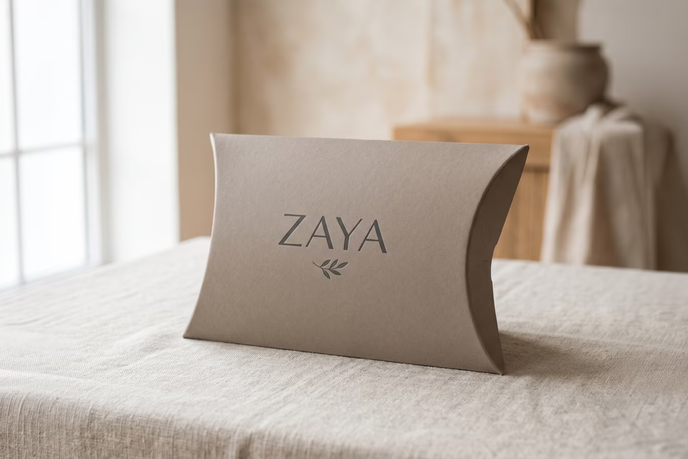
Tactile Matte Coating & Metallic Trim
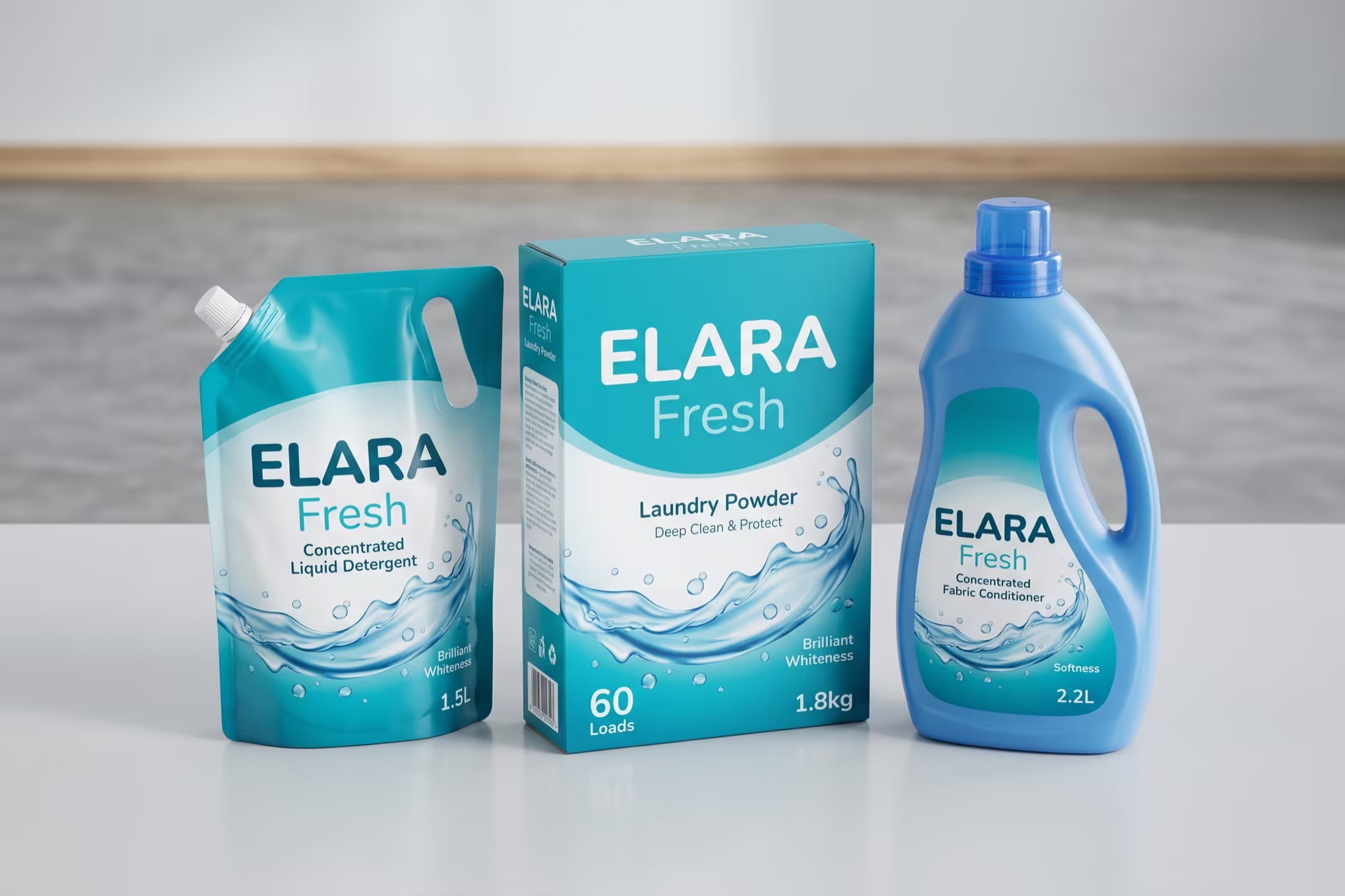
Multi-Angle Render Previews for Vendor Review
Common questions
Everything you need to know before getting started.
Ready to start?