About this service
What is Minimalist Logo Design?
Why choose minimalist design? Memorable: Clean lines and clear concepts stick in the mind. Versatile: Minimalist logos adapt seamlessly across all platforms.
Timeless: Classic elegance transcends trends and fads. Professional: Simplicity exudes sophistication and confidence. Ideahits: Your minimalist logo partner.
We collaborate closely with you to understand your brand’s essence and values. Our skilled designers then translate them into a powerful visual symbol that’s: Unique: Distinctive and ownable, reflecting your brand’s individuality. Balanced: Proportions and negative space create visual harmony.
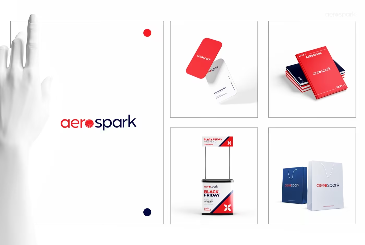
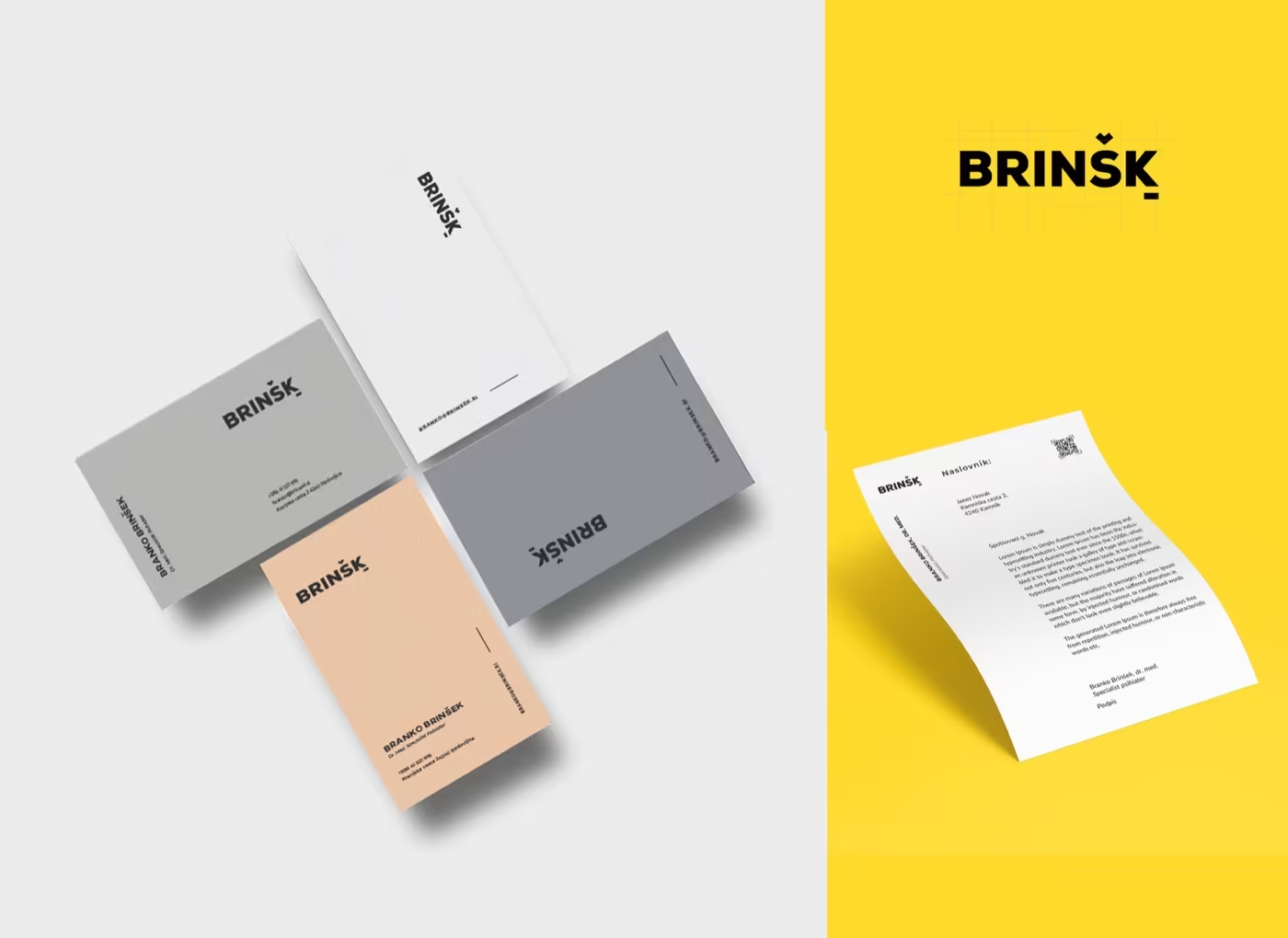
Functional: Works flawlessly across all mediums, from print to digital. Beyond the logo: Ideahits doesn’t stop at just a logo. We develop a comprehensive brand identity system that includes: Color palettes: Carefully chosen hues that support your brand message.
Typography: Fonts that enhance the logo and resonate with your brand. Brand guidelines: Consistent use of your logo and identity across all materials. FQAs about Minimalist Logo Design What is a minimalist logo design?
Simple designs and monochromatic colour palettes are hallmarks of minimalist logos, which make them adaptable to a variety of sizes and media. A brand or company logo should read legibly and efficiently on every medium, including billboards and business cards. Your audience will recognise your design more quickly the less detailed it is.
What is flat minimalist logo design? A two-dimensional, straightforward, silhouette-driven logo is called a “flat” logo design; it frequently lacks highlights, shadows, and other minute elements. Your favourite firms, like Apple, Spotify, Netflix, and Instagram, have most likely adopted a flat logo at some point in the recent past.
What is a famous minimalistic logo? The Nike swoosh, one of the most well-known trademarks in existence today, is the epitome of minimalism. With only a basic brief, the trademark emblem was established in 1971.
Get started →