Use this guide to make a clearer decision before you brief, order, or review a design project.
The beauty industry's premium tier is defined not by what's inside the bottle, but by how the bottle looks and feels. Luxury cosmetic packaging commands higher prices, drives repeat purchases, and creates the aspirational desire that makes a product a gift-worthy object.
Start with the Positioning, Not the Palette
Before choosing a colour or a font, answer these questions: Who is this for? What do they already buy, and what are those brands communicating? What is the single emotion this packaging should create — serenity, power, indulgence, purity? The answers should drive every subsequent design decision.
Luxury positioning typically clusters around a small number of emotional territories: purity and minimalism (clean ingredients, clean design); indulgence and opulence (rich colour, gold, texture); heritage and expertise (classic serif, muted palette); or modern premium (bold geometric, confident silence).
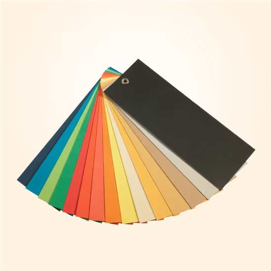
Colour: Less Is Usually More
The most enduring luxury cosmetic packaging uses restrained palettes. La Mer's deep teal. La Prairie's cold silver. Aesop's amber. These are single-colour or two-colour identities that read instantly and consistently across every SKU.
- Black — Authority, sophistication, power.
- White / off-white — Purity, clean ingredients, clinical trust.
- Deep green — Natural, botanical, sustainable luxury.
- Gold and champagne — Opulence, heritage, gift occasion.
Typography: The Most Underrated Element
Font choice is as important as colour in luxury cosmetic packaging. The leading tier almost universally uses refined serif or geometric sans typefaces at modest scale. Luxury is quiet confidence, not loud assertion. Wide letter-spacing on brand names and product descriptors reads elegant and considered.
Finish: Where Luxury Becomes Tactile
- Soft-touch matte laminate — The industry standard for premium packaging. Feels expensive, photographs beautifully.
- Spot UV — Selective gloss areas on matte background. Creates depth, contrast, and tactile interest.
- Hot foil stamping — Gold, silver, rose gold, or custom metallic colour. The definitive premium signal.
- Emboss / deboss — Raised or sunken detail. Creates dimensional texture that reads as handcrafted quality.
ideahits specialises in cosmetic and beauty packaging design, with experience across skin care, hair care, fragrance, and supplements. Start a brief to discuss your product range and positioning.