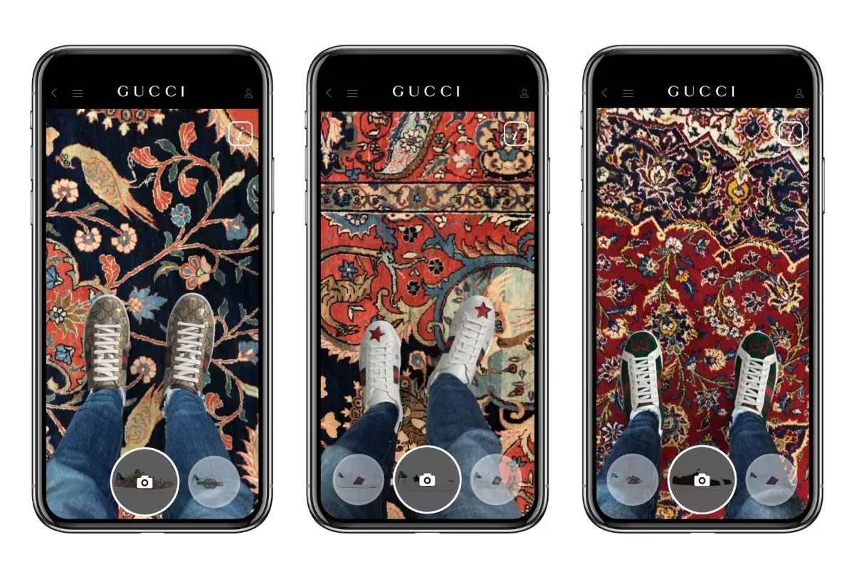
UI design that makes your app easier to use and harder to forget
Strong app UI is more than decoration — it guides people through your product with clarity, confidence, and visual polish. This package covers up to 10 screens, shaped around your core user journey and brand direction.
You receive multiple directions to compare, revisions included while the work is active, and organised Figma files your developers can implement without guesswork.
- Up to 10 app screens designed in one project
- 2–3 visual directions to compare before you choose
- Revisions included until the flow feels right
- Organised Figma files with components and auto-layout
- Export-ready assets prepared for developer handoff
- Dedicated designer support from brief to final files
What you receive
Core user flows
Onboarding, home, key actions, and settings shaped into a clear screen sequence.
Visual UI system
Typography, colour, spacing, and components that keep the app feeling cohesive.
Developer-ready handoff
Named layers, layout specs, and exports your build team can work from immediately.
Platform-aware layouts
Design decisions that respect mobile patterns while staying distinct to your brand.
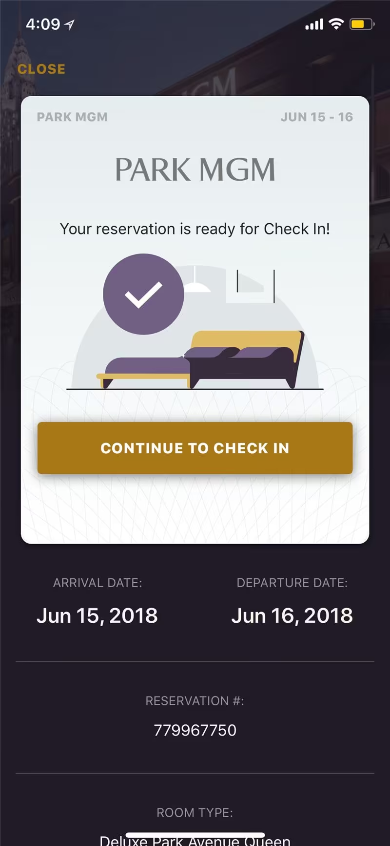
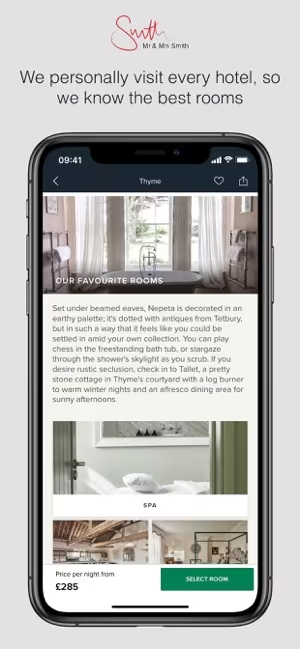
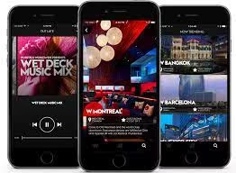
Recent interface work


Common questions
What counts as one screen?
A screen is a single app view in the main user journey — for example splash, sign-in, dashboard, detail view, or checkout step. We scope up to 10 of these in one package.
Do you design in Figma?
Yes. Final delivery is organised in Figma with components, styles, and export guidance so your developers can implement the UI efficiently.
How long does the project take?
Most app UI projects of this size are delivered within 4–8 business days after the brief is confirmed, depending on complexity and feedback rounds.
Can I request revisions?
Yes — revisions are included. Share feedback on the concepts we send and we refine the screens before preparing your final files.