Brand identity pack
Move from one logo to a brand people can actually recognise across touchpoints.
This package extends the mark into the first real brand system so the business looks organised on stationery, presentations, and day-one rollout assets.
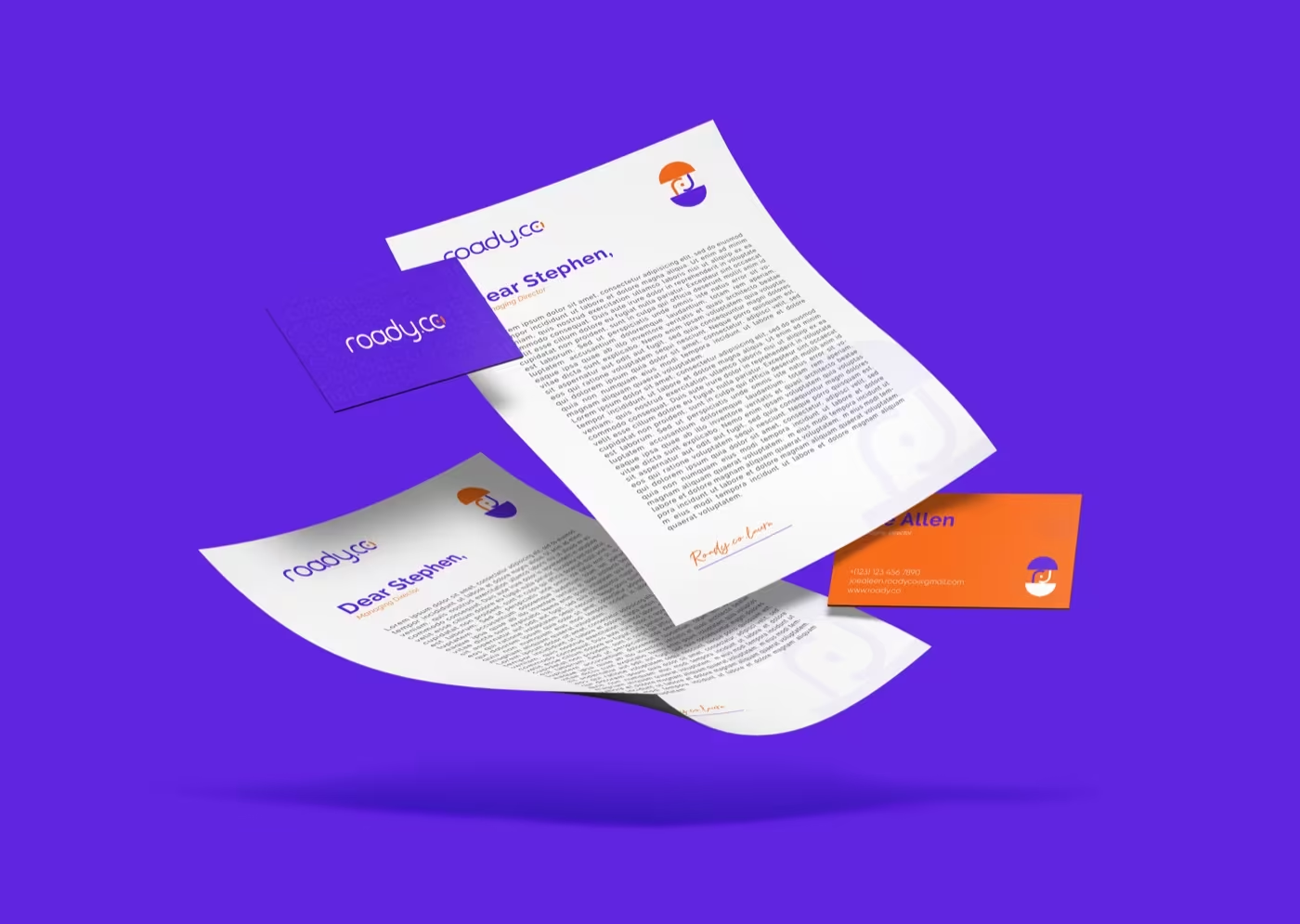
StationeryIdentity in use
ApplicationsA more complete system

PresentationBuilt to explain itself
What changes here
The brand starts acting like a system instead of a single isolated mark.
Once the logo is working, the next job is consistency. This route gives the brand supporting logic, usable applications, and more confidence wherever it shows up.
01
Structure
Identity packs make the brand easier to repeat without losing itself.
Spacing, variants, stationery, and a few core rules create enough structure for the business to stay recognisable from piece to piece.
02
Applications
A stronger mark becomes more persuasive when the supporting touchpoints match.
The first practical applications give buyers more trust because the visual language feels intentional, not improvised.
03
Presentation
A good identity pack should also explain itself clearly to teams and stakeholders.
When the identity is organised in presentation form, approvals get easier and future rollout decisions become more consistent.
How it comes together
We turn the logo into a usable first brand system.
The work moves from mark refinement into the first touchpoints and rules that make the identity easier to use beyond a single file folder.
Primary, secondary, and simplified forms are organised into a usable set.
Colour, type, and graphic rhythm are chosen to support the logo consistently.
We show the identity on practical brand pieces so the system feels real.
You receive a clearer file structure and usage direction for day-one rollout.
Where it shows up
Identity work should prove itself in the first real brand moments.
The examples here focus on the kinds of touchpoints that make a young brand immediately look more established.
Business stationeryThe first pieces buyers and partners expect to look coherent.
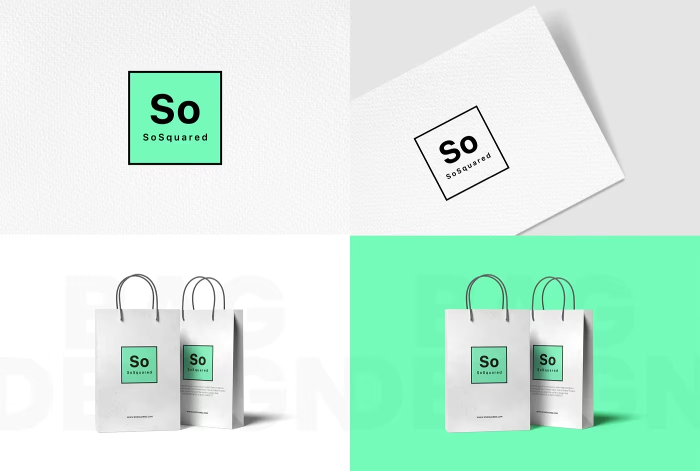
Packaging supportA flexible mark needs to stay recognisable on products too.
Brand presentationA system that can be explained is easier to deploy consistently.
Included here
The core parts of a first usable identity system.
This package is for brands that need more than a logo but are not yet building a full-scale brand book.
- Primary and secondary logo lockups
- Colour and typography direction
- Business card or stationery layouts
- Light usage guidance
- Export files and presentation visuals
Why this is useful
It closes the gap between a logo file and a real brand presence.
More confidence across everyday touchpointsFewer off-brand improvisationsStronger presentation for clients or investorsA clearer base for future rollout
Best for
Brands that need their first real identity system, not just a symbol.
If the business already knows it needs stationery, structure, and simple guidance, this route gives it a much more complete start.
This package connects the mark to the first practical applications.
The identity is easier to explain and approve when it is organised visually.
It creates a stronger base before a bigger rollout later on.