Poster campaign set
Design campaign visuals that still land after one glance.
This page is for posters, billboards, and large-format moments where the viewer will not give you much time.
BillboardBig-message clarity
PosterReadable in motion
ScaleDesigned for distance
Why this subcategory matters
Posters work when the message survives scale, speed, and clutter.
These pieces need to hit quickly, read clearly, and still feel branded enough to be remembered after the moment passes.
01
Distance
The hierarchy must work before the details do.
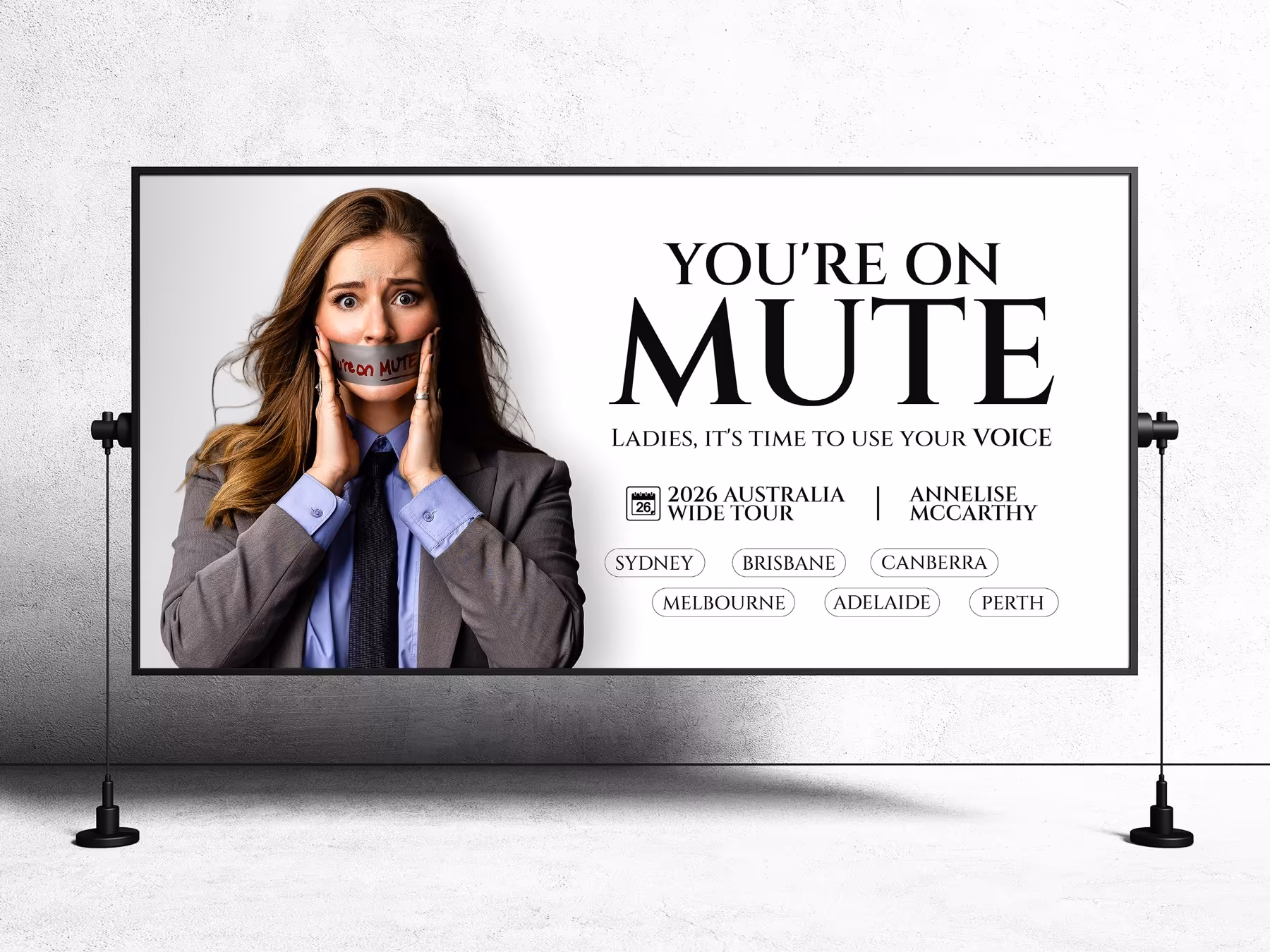
At billboard scale, the strongest decision is often what to remove so the headline and visual cue stay unmistakable.
02
Environment
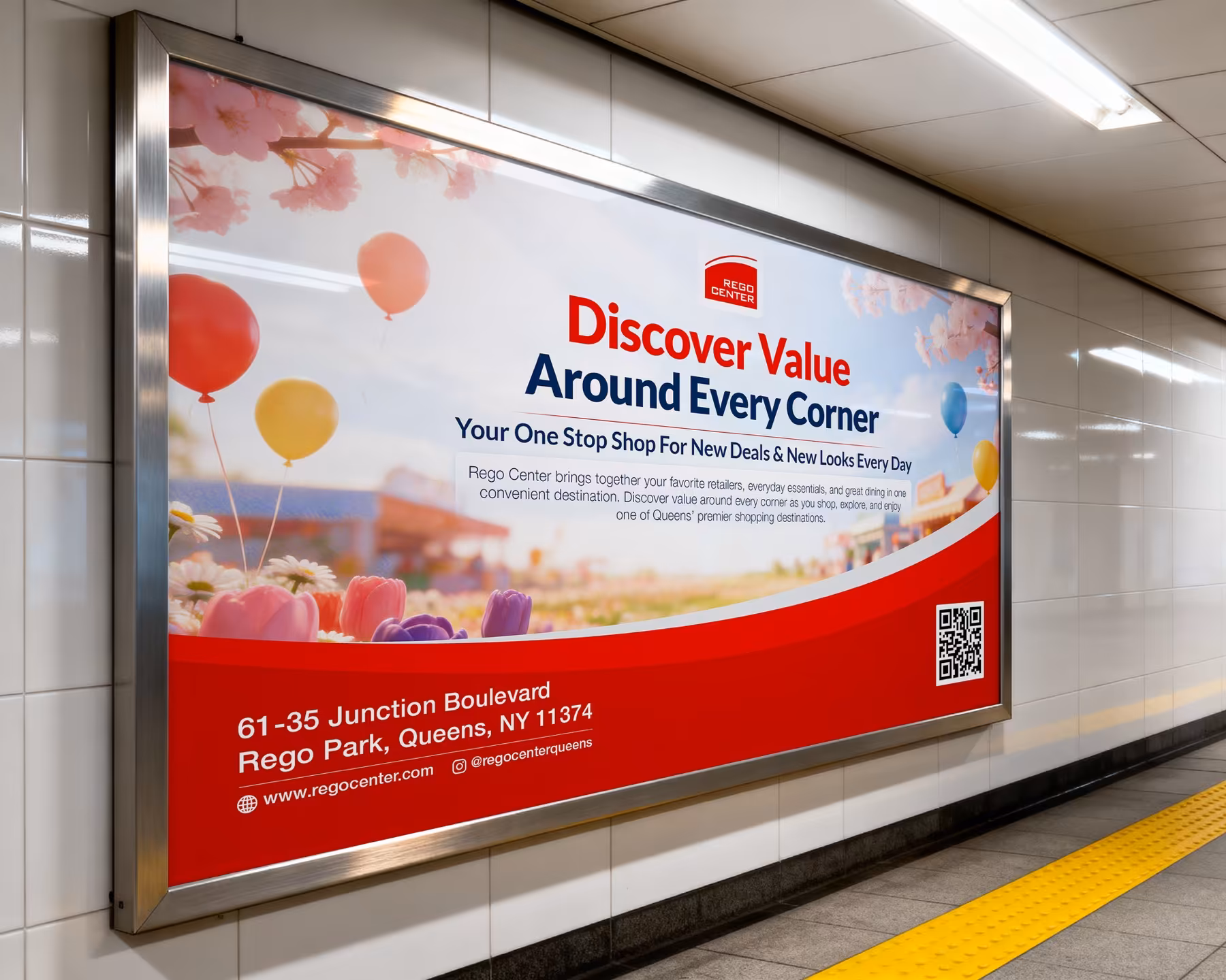
Posters compete with the place around them, not just with other graphics.
Good layout decisions help the message stay visible in real streets, stations, and crowded ad spaces.
03
Recognition
Campaign sets feel stronger when multiple placements still read as one idea.
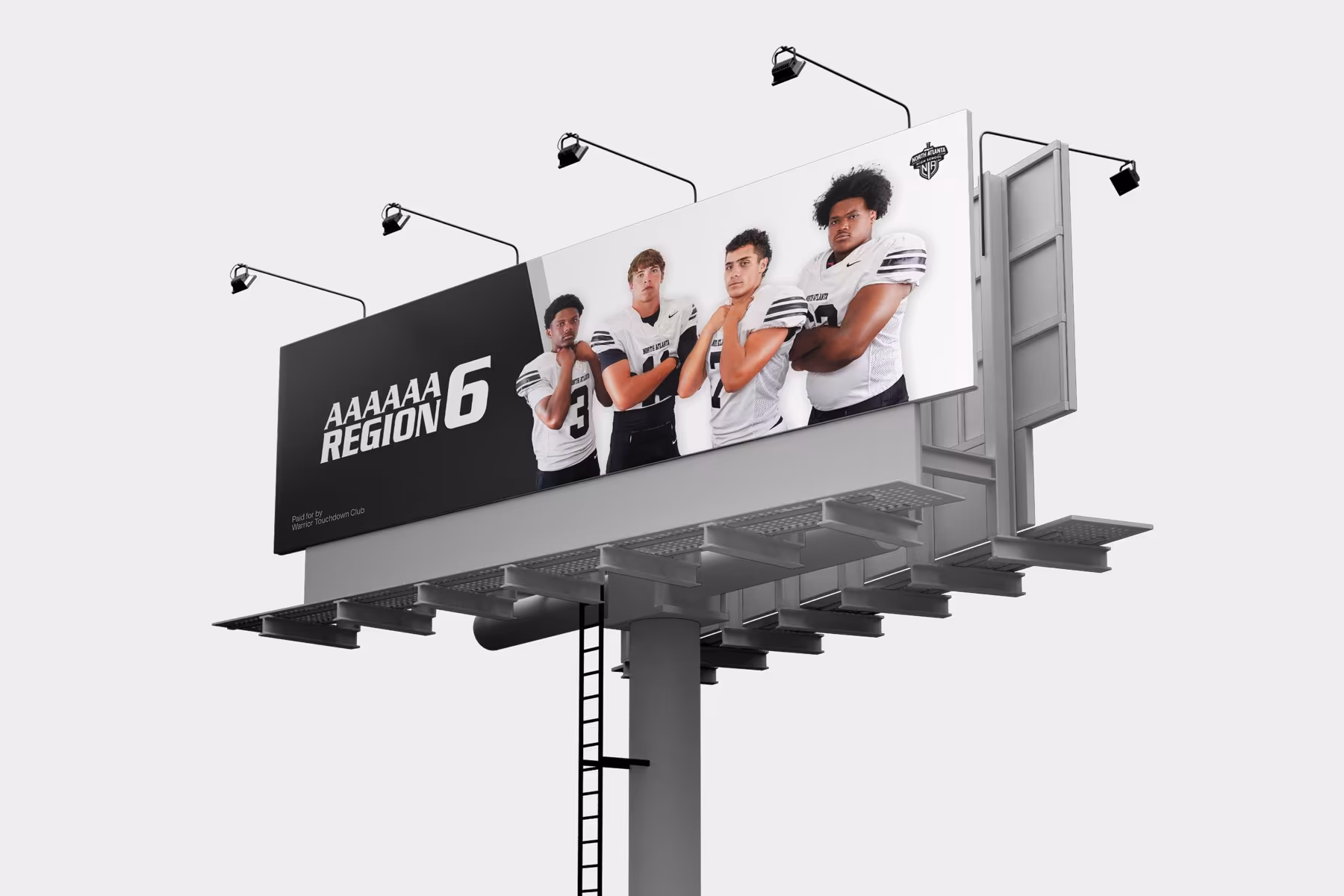
A poster route needs enough flexibility to move across sizes without losing its visual anchor.
How it gets built
We strip the message down until the strongest version stays visible.
The design work focuses on big-scale hierarchy, strong typographic decisions, and campaign consistency across large placements.
We isolate the one idea the viewer should notice first.
Visual weight and copy pacing are adjusted for quick distance reading.
The concept is resized for billboard, poster, or supporting campaign placements.
Final exports are organised for print teams and approval rounds.
Featured poster moments
These placements show whether the campaign still has enough force at scale.
The references here stay close to large-format ad moments rather than broader marketing collateral.
Hero billboardOne strong message placed for big visibility.
Transit posterStructure that reads in motion and under clutter.
Regional outdoorThe system can hold across multiple outdoor placements.
Included here
A campaign set focused on large-format visibility.
This page is deliberately narrow: it is about poster impact, not a full collateral stack.
- Poster or billboard master concept
- Supporting size adaptations
- Readable copy hierarchy
- Print-ready exports
- Mockups for approval
Why this helps
It turns a crowded campaign brief into one visible idea.
Clearer big-scale hierarchyMore readable poster pacingA stronger outdoor first impressionBetter consistency across placements
Best for
Campaigns that need to be seen quickly and remembered cleanly.
If the priority is strong poster visibility rather than a broader campaign suite, this route keeps the work focused.
This page prioritises the first-second read.
The designs are shaped for distance and environment.
It gives the rollout one stronger visual anchor.