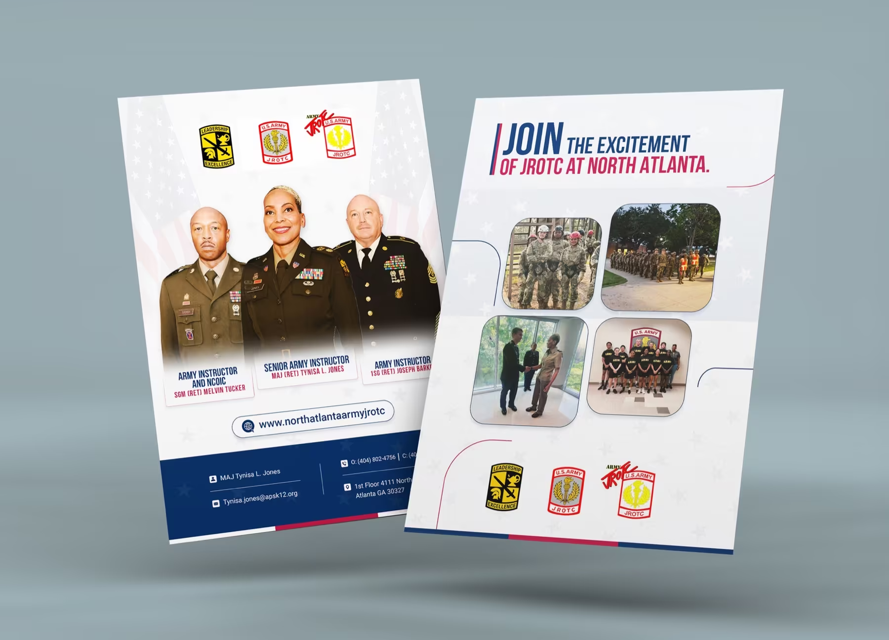
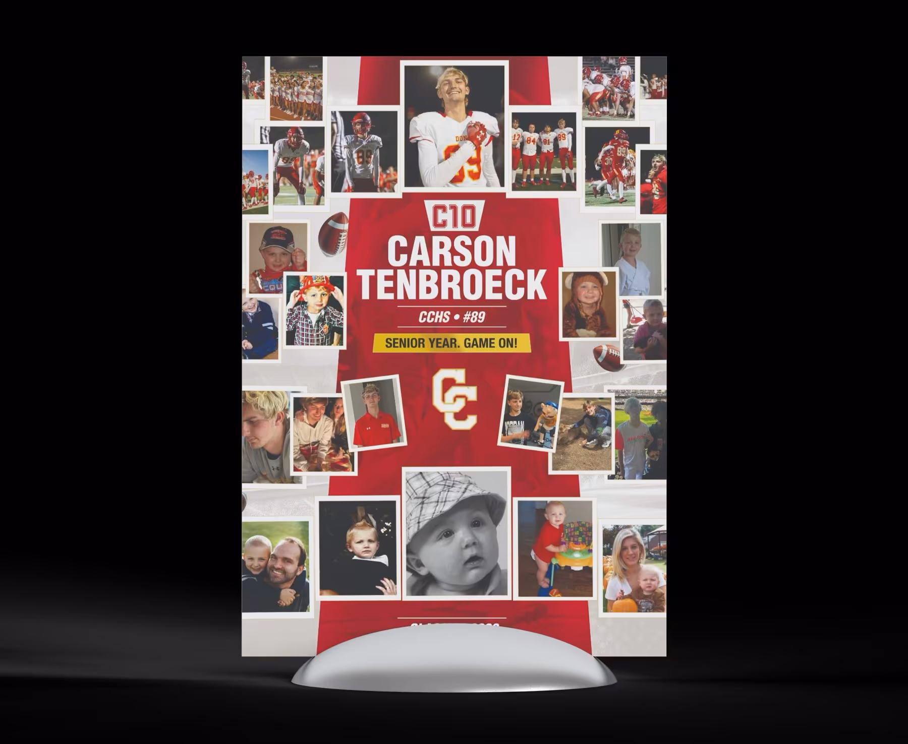
Flyer & one-pager layout
Turn crowded business information into something people can actually scan.
This route is built for print-first business collateral where the challenge is structure, hierarchy, and getting key information noticed quickly.
FlyerSharper information flow
CollateralSupports real events
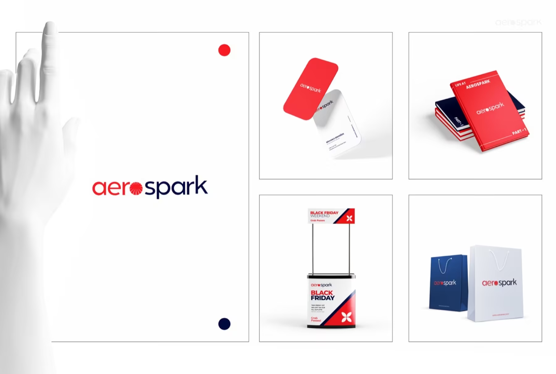
SystemCollateral can scale
Why this route matters
Business collateral often fails because everything is present but nothing is prioritised.
A better one-pager or flyer does not add more. It organises the message so the offer, proof, and next step feel much easier to follow.
01
Hierarchy
The page needs a clear reading path before the design can feel polished.
The strongest flyer layouts tell the eye where to go first, second, and third without forcing the reader to work for it.
02
Context
Printed collateral still needs to feel contemporary and trustworthy in real settings.
Support materials like display pieces or event collateral work better when they share one clean visual language.
03
Expansion
A good one-pager can become the seed for a wider collateral system.
Once the structure is right, the same logic can extend into decks, handouts, and supporting promotional pieces.
How we build it
We simplify the message before we style the page.
This keeps the design grounded in readability rather than decoration.
We decide what should lead, support, or disappear.
Headings, blocks, and supporting proof are arranged into a clearer flow.
Typography, imagery, and colour are used to reinforce that structure.
The final files are organised for printing, PDF use, or internal handoff.
Where it works best
This is the route for print and presentation pieces that need less clutter and more authority.
The examples focus on business collateral rather than social or outdoor ad formats.
Flyer routeA page that reads quickly and still feels polished.
Display supportCollateral that helps at events and physical promotional moments.
Extended systemThe same logic can support a broader collateral family.
Included here
A cleaner information-led collateral package.
The focus is on pages that explain clearly, not just look decorated.
- Flyer or one-pager concept
- Grid and type hierarchy
- Supporting collateral adaptation
- Print-ready exports
- Presentation mockups
Why it helps
It gives the business a clearer way to explain itself on one page.
Stronger reading flowCleaner layout hierarchyMore polished print presenceCollateral that feels easier to trust
Best for
Businesses that need clearer one-page communication before anything more elaborate.
If the current collateral feels dense or generic, this route sharpens the explanation first.
This route prioritises structure over visual noise.
The delivery is shaped for practical collateral use.
It creates a cleaner foundation for future materials.